
The Hitchhiker’s Guide to Moodcamera Emulations
The Hitchhiker’s Guide to Moodcamera Emulations
Or: how I stopped letting my iPhone correct my photos and started making mistakes on purpose again
There was a moment when shooting with an iPhone became too perfect.
Too sharp.
Too clean.
Too smart.
Too convinced it knew what I wanted.
Every photo looked corrected before it even existed. The sky recovered. The shadows opened. The skin smoothed. The contrast politely adjusted. The whole scene tucked in, combed, medicated, and sent out into the world with good grades and no criminal record.
Everything was fine.
Everything was dead.
Then I started using Moodcamera, and for the first time in a long while, I picked up the iPhone not as a phone, not as a scanner, not as a social media feeding tube, but as a camera.
A camera with an opinion.
A camera that doesn’t try to save every highlight from extinction.
A camera that doesn’t sharpen every leaf until nature looks like a product render.
A camera that lets light get weird again.
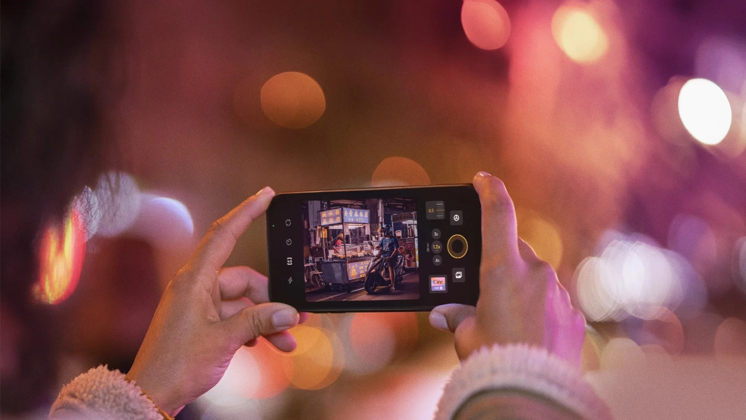
Moodcamera is a point-and-shoot camera app built around the idea of getting finished-looking images straight out of the iPhone, without the usual ritual of shooting first and fixing later. Its official description leans into natural photos, filmic character, realistic grain, halation, bloom, and a richer color palette rather than the over-sharpened, over-processed look we associate with default phone photography. (Mood Camera)
That is the trick.
Moodcamera does not feel revolutionary because it gives you more control. We already have more control. We have sliders, masks, curves, LUTs, profiles, presets, AI suggestions, adaptive corrections, selective edits, neural everything.
Control is not the problem.
The problem is that the iPhone often behaves like a nervous assistant who keeps saying, “Don’t worry, I fixed it,” while quietly removing the soul from the room.
Moodcamera works because it gives you a decision before the photo happens.
You choose an emulation.
You choose a mood.
You accept the consequences.
The app’s own FAQ explains that its emulations are inspired by the classic qualities of film, not by the exact look of one specific film stock. That distinction matters. These are not scientific clones. They are color personalities. Families of lies. Different ways to persuade the iPhone to stop being an iPhone. (Mood Camera)
So this is not a lab report.
This is a field guide.
Moodcamera currently presents itself around a broader set of color emulations, and new ones may appear over time, but this guide focuses on the twelve color engines I consider the essential map: Vista, Nord, Xenon, Cine, Taiga, Apollo, Analog, Chrome, Gold, Portra, Calypso, and Arizona. (Mood Camera)
Twelve little planets.
Twelve bad decisions.
Twelve ways to make a photograph less correct and more alive.
VISTA
Vista still believes in fresh air.
It is the healthy one. The one that drinks water. The one that owns hiking shoes and probably knows where the sunscreen is.
Vista is built for open spaces, blue skies, green hills, water, sunlight, landscapes that want to breathe. It gives you color that feels clean without becoming clinical. It likes nature, but not in a tragic way. It likes grass. It likes the sea. It likes the kind of day when the air looks recently washed.
This is the emulation you reach for when you want the world to look alive, but not deranged.
The danger is postcard syndrome.
Too much Vista and everything starts looking like it has been approved by a tourism board. The greens get a little too pleased with themselves. The blues start waving at strangers. The photograph becomes pretty in that suspicious way where you know a committee was involved.
Use Vista when the scene already has space and light. Use it for mountains, beaches, trees, villas, white walls, clean shadows, summer roads. Use it when the photo needs generosity.
Do not use it when you want rot, memory, dust, or psychological damage.
Vista is not here for your haunted interiors.
Vista packed snacks.
NORD
Nord is what happens after Vista reads the news.
Cooler. Quieter. Less impressed.
Nord is a cold emulation, but not a theatrical one. It does not scream “cinematic.” It does not dump blue dye over everything and call it atmosphere. It simply removes warmth until the world starts telling the truth in shorter sentences.
It works beautifully with concrete, stone, steel, glass, overcast skies, wet streets, gray sea, winter beaches, anonymous buildings, and places that look like they have been waiting for someone who is not coming.
Nord is not sad, exactly.
It is sober.
That is worse.
It is very good when you want to strip the iPhone of its cheerful little habit of making everything pleasant. Nord reduces the emotional sugar. It gives you structure. It gives you air. It gives you silence.
But be careful with skin.
On people, Nord can become a crime scene if you let it run unchecked. Faces can turn cold, bloodless, faintly medical. If you photograph someone you love with Nord, add warmth or prepare an apology.
Nord is for architecture, weather, absence, distance.
Nord is for a chair by a window.
Nord is for a ferry terminal.
Nord is for a hotel hallway at 7:13 a.m.
Nord does not flirt.
Nord files a report.
XENON
Xenon is Nord after midnight.
Blue, electric, sharper in the teeth.
If Nord is an overcast afternoon, Xenon is a gas station at 2 a.m. It is headlights in rain. It is an elevator mirror. It is a street where every window looks like evidence.
Xenon is a night emulation. It wants artificial light. It wants signs, LEDs, reflections, car interiors, convenience stores, wet asphalt, train platforms, chrome, glass, cheap plastic under hard illumination.
It gives cold colors authority.
The shadows tighten. The highlights get louder. The blues become less like sky and more like voltage.
This is not the emulation for a peaceful family dinner unless your family dinner involves surveillance footage.
Xenon can be beautiful, but it is not subtle. It is better when the scene already contains some tension. A dark street. A glowing shop window. A dashboard. A hallway. A body of water under city lights.
During the day, Xenon can feel like an accident.
At night, it can feel like the truth.
Use bloom carefully. Use halation if there are real lights in the frame. Let the bright parts bleed a little. Let the darkness keep its job.
Xenon is not nostalgic.
Xenon is awake.
CINE
Cine knows what it is doing.
That is both the appeal and the problem.
Cine is the orange-teal universe. Warm highlights, cooler shadows, a little drama in the bloodstream. It gives you the feeling that something is about to happen, even if you are photographing a parked scooter and a trash bin.
Especially then.
Cine is seductive because it organizes the world into story. It makes light directional. It makes color meaningful. It tells your photo to stand up straight and pretend it has a third act.
This is useful.
This is dangerous.
Use Cine when the scene can support the lie. Streets. Interiors with mixed light. People in shadow. Backlight. Cars. Nightlife. Seaside towns at dusk. Places where warm light and cool shadow are already negotiating.
Do not use Cine on everything unless you want your breakfast to look like the opening scene of a prestige crime series.
The trick with Cine is restraint.
Low or medium strength. Saturation down a little. Contrast controlled. Bloom only if the light deserves it.
Cine should suggest cinema, not wear a director’s chair around its neck.
At its best, Cine makes the iPhone feel less like a device and more like a witness.
At its worst, it makes a sandwich look emotionally unavailable.
TAIGA
Taiga is green, but not happy green.
Not lawn green.
Not tropical green.
Not “look how alive everything is” green.
Taiga is forest green. Wet green. Moss under cloud cover. Pine needles. Mountain shade. A cold lake that does not care whether you brought a towel.
It is a natural emulation, but restrained. It lives somewhere between landscape and silence. It is excellent for woods, mountains, cloudy hikes, stone paths, muted vegetation, places where the color should be present but not excited.
Taiga is one of the most useful emulations if you want nature without postcard optimism.
But it has a weakness.
The green can spread.
If the scene already contains a lot of green, Taiga may deepen it beautifully. Or it may turn the whole image into soup. If you use it indoors, around beige walls, wood, or skin, watch what happens to the shadows. They can go damp. Not moody. Damp.
There is a difference.
Taiga works when green is the subject.
It fails when green becomes an infection.
Use it for forests, mountains, rough weather, northern landscapes, garden shadows, wet stone, and places that smell like bark and old rain.
Do not use it for warm domestic nostalgia.
Taiga does not remember your childhood.
Taiga remembers the tree line.
APOLLO
Apollo is not here to be reasonable.
Apollo is red. Pink. Warm. Emotional. It does not enter the room. It arrives through the ceiling with a trumpet and a minor emergency.
This is the emulation for sunsets, sunrises, glowing clouds, flowers, neon warmth, skin under late light, and skies that look like they are confessing something.
Apollo can be magnificent when the light is already dramatic. It takes an emotional scene and turns the volume up until the walls complain.
But it is not an everyday emulation.
Apollo on a normal scene can feel like too much perfume in an elevator. Apollo on skin can push warmth into theatrical territory. Apollo on interiors can become sentimental in the worst way, like a memory that has been colorized by someone who did not trust the original.
Use Apollo when red or pink is already part of the image’s reason to exist.
Do not use it to create emotion out of nothing.
That is how photographs become manipulative.
Apollo is for skies, flowers, heat, fever, farewell, religious experiences in parking lots.
Apollo is not subtle.
Apollo has never once lowered its voice.
ANALOG
Analog is the trap.
The name promises everything. Film. Memory. Imperfection. The good old disease. You see “Analog” and think: yes, this is the one. This is where the magic lives.
Then you shoot a dim room and suddenly your walls are green, your wood looks ill, and your shadows have the emotional range of a damp basement.
Analog carries green.
That is not a bug. That is the personality.
It can be fantastic. Truly. Analog is perfect when you want a retro, slightly dirty, greenish, lived-in image. Old salons. Fluorescent interiors. Faded wallpaper. Strange shops. Waiting rooms. Places with plastic chairs. Places where time got stuck and nobody came back with tools.
Analog can make an image feel found instead of taken.
But it is not a universal vintage button.
That is the mistake.
If you want warm nostalgia, start with Gold. If you want skin, start with Portra. If you want summer, start with Calypso. Use Analog when you specifically want that greenish retro contamination.
Analog is not “film.”
Analog is a film print left in a drawer in a house with bad plumbing.
Beautiful, if that is what you wanted.
A problem, if it is not.
CHROME
Chrome does not whisper.
Chrome is color with elbows.
Vivid, punchy, contrasty, slightly violet in spirit. It likes graphic scenes. It likes painted walls, street signs, cars, fashion, hard sun, bold shapes, urban color, anything that already has a little arrogance.
Chrome gives the iPhone a cleaner kind of aggression. Not cinematic like Cine. Not nostalgic like Gold. Not polite like Portra.
Chrome is modern, but with character.
It can be excellent for street photography because it respects shape and color. It makes reds, blues, yellows, and artificial surfaces feel intentional. It does not ask whether the scene is emotionally complex. It asks whether the scene has impact.
The danger is obvious.
Too much Chrome and the image becomes loud. Colors start competing. Contrast hardens. Skin gets less forgiving. Subtle scenes lose their nervous system.
Chrome is a blade.
Do not use it to butter toast.
Use it when the scene has graphic strength. Use it when you want a punch. Use it when you want color to behave badly, but with good posture.
Avoid it when you want softness, dust, memory, or forgiveness.
Chrome is not here to forgive.
Chrome is here to cut.
GOLD
Gold is where I go when I want warmth without the green infection.
Gold is not just yellow. That would be too easy. Gold is warmth with a memory attached. Wood, sun, dust, old paper, skin, curtains, summer rooms, family tables, travel objects, hotels, ceramic plates, afternoon light on walls.
Gold is one of the most useful Moodcamera emulations because it can become vintage without becoming rotten.
That matters.
Analog can give you age, but it often drags green with it. Gold gives you age through warmth. It feels more domestic, more human, more physical. It turns digital files into objects. Not always, but often enough to trust it.
Use Gold for interiors, sunlight, old furniture, Mediterranean towns, beach houses, portraits in warm light, objects on tables, food, faded signs, late afternoon walks.
But watch the heat.
In a scene that is already warm, Gold can become too much. Wood gets heavier. Beige walls go sepia. Skin can move toward orange. If that happens, lower saturation, keep temperature under control, and do not push the strength like a maniac.
Gold is not subtle by default, but it is controllable.
That is why it works.
Gold is the emulation that says: this happened once, and maybe it mattered.
PORTRA
Portra is the civilized one.
Soft color. Warm skin. Pastel restraint. It is the emulation that understands people are not buildings and faces are not billboards.
If Gold is memory, Portra is kindness.
It is probably the safest starting point for portraits and everyday photographs involving humans. It handles skin with more grace than Chrome, more warmth than Nord, less danger than Analog, and less drama than Cine.
Portra is not boring.
It is disciplined.
It works with window light, family moments, interiors, portraits, couples, children, soft daylight, quiet scenes, pale colors, white shirts, cream walls, natural skin, and anything where you want beauty without shouting.
The danger is that Portra can become too pleasant.
Pleasant is useful. Pleasant is also where photographs go to lose their teeth.
If the scene needs dirt, Portra may clean it. If the scene needs anxiety, Portra may calm it down. If the scene needs a little wrongness, Portra may behave too well.
Still, when there are people in the frame and you do not want them to look like victims of a color experiment, Portra is the sensible first move.
Portra does not kick the door open.
Portra knocks.
CALYPSO
Calypso has already left for the beach.
Blue water. Orange warmth. White walls. Sun. Shirts. Swimsuits. Plastic chairs. Boats. Hotel balconies. Turquoise pools. Skin under summer light. The whole vocabulary of vacation, but hopefully without the sponsored content aftertaste.
Calypso is bright, summery, and dangerous if you let it become too cheerful.
That is the problem with summer. It thinks it is helping.
Used well, Calypso is excellent for Mediterranean color: sea, sky, umbrellas, painted shutters, pale stone, dresses, towels, fruit, postcards, the sort of scene where light is not subtle but still beautiful.
Used badly, it becomes travel influencer soup.
The secret is to restrain it.
Lower saturation. Keep strength moderate. Pull contrast down if needed. Add bloom for a softer postcard feel. Add fade if you want a Riviera, 1950s, sun-bleached quality.
Calypso can become elegant.
But you have to take away its energy drink.
Do not use it for dark interiors. Do not use it for moody domestic scenes. Do not use it in low light unless you enjoy disappointment.
Calypso wants air.
Calypso wants water.
Calypso wants to know why you are still inside.
ARIZONA
Arizona is heat after the romance is gone.
Not golden like Gold.
Not gentle like Portra.
Not festive like Calypso.
Arizona is dry. Warm. Low-contrast. Earthy. Dusty. It is the color of walls that have survived too many summers. Roads, sand, sun-bleached paint, terracotta, desert light, dry grass, motel signs, empty lots, places where shade is not relief but a negotiation.
Arizona is interesting because it does not just warm the image. It flattens the heat into the scene. The contrast is lower, the color is still warm, and the overall effect can feel sunburned rather than sunset-like.
That is useful.
Use it for hot streets, dry landscapes, old walls, southern towns, dusty roads, summer afternoons, beige architecture, rust, faded paint, roadside scenes, and anything that should feel baked rather than glowing.
The risk is mud.
Warm low contrast can quickly become a brown blanket over everything. On interiors with wood, it may get heavy. On skin, it can go orange. On weak light, it can feel less like atmosphere and more like underexposure giving up.
Arizona is not for romance.
Arizona is for heat.
Arizona is the sun after it stopped caring whether you liked it.
How to Choose the Right Emulation
The question is not: which one is best?
That is the wrong question.
That is a shopping question.
That is how you end up with twelve presets you do not understand and three hundred photos that all look like they were edited by a tired algorithm.
The real question is:
What kind of lie does this picture need?
A clean, natural lie?
Use Vista.
A cold, quiet lie?
Use Nord.
A night-time, electric lie?
Use Xenon.
A cinematic orange-teal lie?
Use Cine.
A damp, natural, forest lie?
Use Taiga.
A red, emotional, sunset lie?
Use Apollo.
A green, retro, corrupted lie?
Use Analog.
A vivid, graphic, high-impact lie?
Use Chrome.
A warm, domestic, golden lie?
Use Gold.
A gentle lie about skin?
Use Portra.
A summer lie?
Use Calypso.
A dry, dusty, sun-baked lie?
Use Arizona.
That is why Moodcamera works for me.
It does not just give me a look. It makes me choose a point of view before I press the shutter.
And that tiny delay matters.
Because the default iPhone camera often feels like it wants to remove decisions. It wants to optimize everything, rescue everything, clarify everything, brighten everything, sharpen everything, make every file usable, shareable, acceptable.
Moodcamera does the opposite.
It makes the image less universal and more yours.
You choose the emulation.
You choose the flaw.
You choose the direction of the damage.
That is photography, or at least the part of photography I had missed.
Not the megapixels.
Not the dynamic range.
Not the holy war between sensors and phones and film stocks and computational pipelines.
Just this:
A scene in front of you.
A small machine in your hand.
A color decision made too early.
A result you cannot fully control.
And for one second, before the image appears, a little suspense.
Not much.
Just enough to feel alive again.
Moodcamera also includes two black-and-white emulations, and they deserve their own separate mention.
They are not afterthoughts.
They are not “color, but without color.”
They are not the sad little monochrome button you press when a photo has failed and you want to pretend it was intentional.
They have character.
MONO is the cleaner one. More restrained. More classic. It gives you a black-and-white image that still feels photographic rather than decorative. Good for street, architecture, portraits, quiet interiors, hard light, soft light, almost anything that needs form more than color. It does not scream old movie. It does not beg for drama. It simply removes color and asks whether the picture can survive without it.
That is a cruel test.
A useful one.
NOIR, instead, comes in wearing a coat it probably stole from a dead detective.
Darker. Harder. More theatrical. More contrast. More shadow. Noir does not remove color; it interrogates the scene until color gives up and leaves the room. It wants night, faces, lamps, wet streets, mirrors, alleys, smoke that may or may not be there, and moral decisions made badly.
Mono is memory.
Noir is evidence.
Mono looks at the world and says: simplify.
Noir looks at the world and says: confess.