
Quality and Tone: The Two Moodcamera Settings Everyone Underestimates
Quality and Tone: The Two Moodcamera Settings Everyone Underestimates
Or: how to mutate a perfectly good preset without admitting you have created a new animal
This post closes the loop on Moodcamera settings.
First, we talked about the emulations.
The big personalities. The color engines. The little chemical religions inside the app.
Gold. Portra. Cine. Analog. Tungsten. Chrome. Calypso. The whole unstable family.
Then we talked about custom presets.
How to build them. How to choose a base. How not to drown everything in grain. How not to use Bloom like a fog machine operated by a nervous teenager.
Now comes the part most people skip.
The two small selectors under every preset:
Quality and Tone.
They look harmless.
They are not.
Because when you select a Moodcamera preset, you are not just choosing Portra, Gold, Cine, or Tungsten.
You are choosing a formula.
Something like:
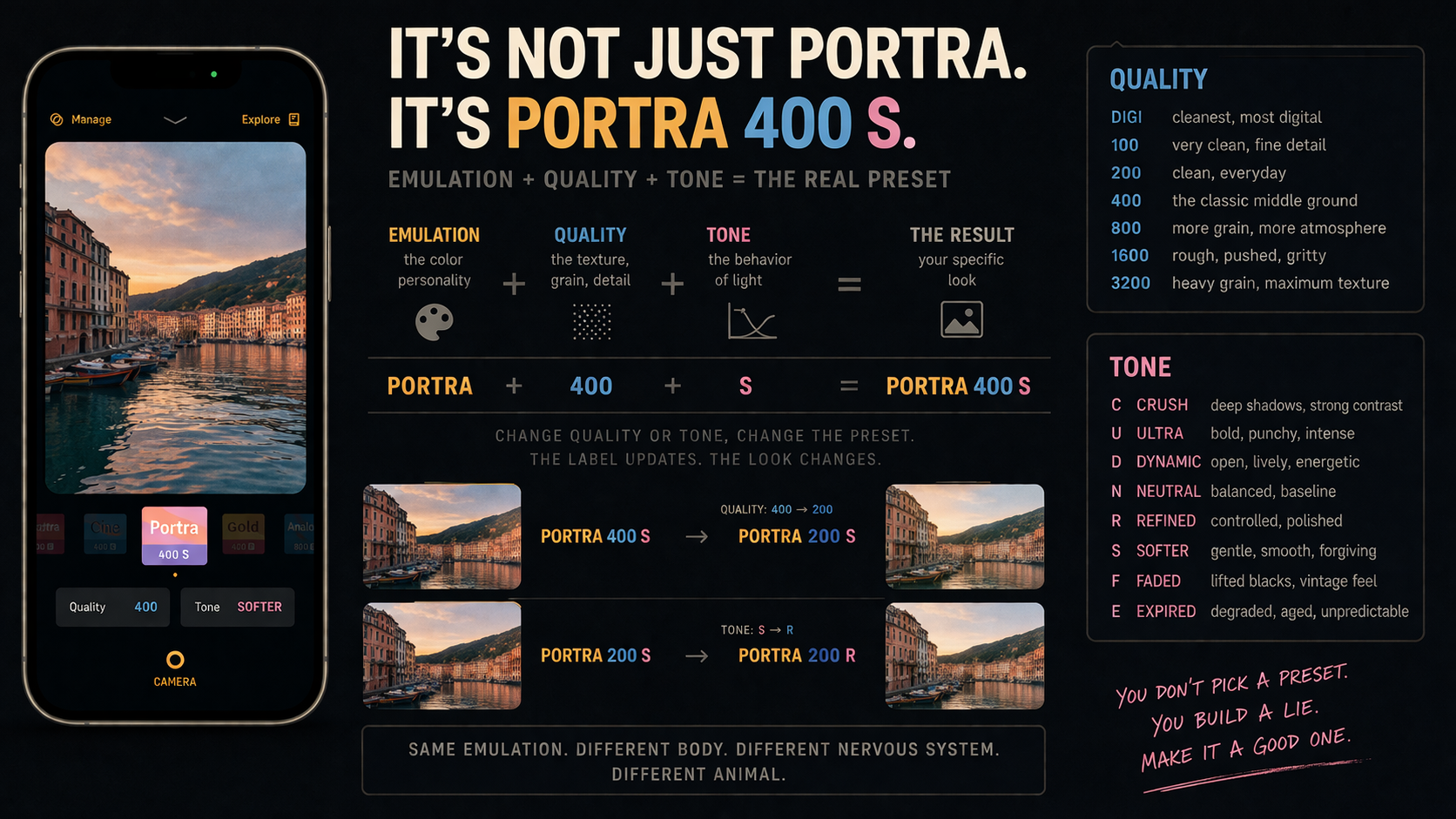
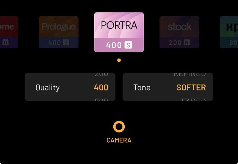
Portra 400 SWhich means:
Portra  = emulation
400     = Quality
S       = Tone / Softer
That is the real preset.
Not Portra in the abstract. Not some vague idea of film color. Not a romantic little button that makes your iPhone grow a soul.
Portra 400 S is a specific combination.
And this matters because not every possible combination exists as a default preset.
For example, Portra 800 F may not be one of the default presets presented by the app. The default may be Portra 400 S.
But once you touch Quality and Tone, you can change the behavior radically.
You are still inside Portra.
But you are no longer looking at the same Portra.
Change Quality from 400 to 800, and the image gets worst.
Change Tone from Softer to Faded, and the tonal behavior becomes less controlled.
And Moodcamera tells on you immediately.
The label updates.
Portra 400 Sbecomes:
Portra 800 F
Then, if you change Tone:
Portra 800 RThe app is not being cute.
It is giving you the formula.
You changed the body. You changed the nervous system. So the name changes too.
Same emulation. Different Quality. Different Tone. Different animal.
1. It is not enough to choose Gold, Cine, or Portra
People talk about Moodcamera emulations as if they are the entire preset.
They are not.
The emulation is the personality.
But personality alone is not enough. Everyone knows someone with a huge personality and no structure. Usually they are at dinner parties explaining NFTs or using the word “cinematic” near a cappuccino.
A Moodcamera preset needs more than personality.
It needs a body. It needs pressure. It needs a nervous system.
That is where Quality and Tone come in.
The emulation decides the color world.
Quality decides how clean, grainy, sharp, rough, or degraded that world feels.
Tone decides how the light behaves. How deep the blacks are. How bright the highlights feel. How much the image is crushed, softened, faded, refined, expired, polished, or dragged behind a car through 1976.
Same emulation, different Quality and Tone, completely different photograph.
Gold 100 NClean, warm, usable.
Gold 400 FSofter, older, more like a print found in a drawer.
Gold 800 EThe drawer smells strange and nobody wants to talk about why.
Same Gold.
Different crime.
2. How to read a Moodcamera preset
A Moodcamera preset label is not just a name.
It is a formula.
When you see this:
Cine 400 Nread it like this:
Cine = emulation
400  = Quality
N    = Tone
That is all.
Three parts.
The emulation gives the image its color personality. Quality decides how clean or grainy it feels. Tone decides how the light, contrast, shadows, and highlights behave.
So Cine 400 N means:
Cine color
400 texture
Neutral tone
Change one part, and Moodcamera updates the label.
Cine 400 Nbecomes:
Cine 800 Nif you change Quality.
Then it becomes:
Cine 800 Fif you change Tone to Faded.
The app is telling you exactly what changed.
Same emulation. Different Quality. Different Tone. Different result.
That is the whole trick.
3. Quality does not mean quality
This is the first trap.
The word Quality sounds like a hierarchy.
Good quality. Bad quality. High quality. Low quality.
Wrong.
In Moodcamera, Quality is not asking:
“Do you want the photo to be good?”
Of course you want the photo to be good. Nobody opens a camera app thinking, please give me the visual equivalent of an apology.
Quality is really asking:
How clean or grainy should this image feel? How much detail should survive? How much analog texture should cover the digital file? How much should the photo feel like a sensor, and how much should it feel like matter?
The values are:
DIGI
100
200
400
800
1600
3200
Think of them as a scale from clean to dirty.
From smooth to gritty. From digital clarity to photographic texture. From “nice file” to “this image has been through something.”
And no, 100 is not better than 800.
100 is cleaner. 800 is rougher. 1600 is angrier. 3200 has probably stopped answering texts.
Better depends on the lie.
4. The Quality values
DIGI
DIGI is the cleanest option.
More digital clarity. Less grain. Less analog dirt in the room.
Use it when you want clean lines, more detail, architecture, skin without too much grit, or an emulation’s color without heavy texture.
Good with:
Stock
Vista
Portra
Chrome
Cine
DIGI is not bad.
DIGI is sober.
Sometimes sober is the wrong mood.
100
100 is clean, fine, and detailed.
It feels more photographic than DIGI, but still elegant and controlled.
Use it for daylight, travel, landscapes, architecture, clean portraits, seaside light, pale walls, and strong sun.
Good for:
Vista
Portra
Gold
Stock
Calypso
100 is the clean shirt.
Some photos need a clean shirt.
Other photos need a jacket that has slept in a train station.
200
200 is the quiet sweet spot.
Still clean. Still detailed. But the image starts to breathe a little.
Less sterile than 100. Less textured than 400.
Use it for daylight street, portraits, interiors with decent light, family images, table scenes, warm domestic objects.
It is a good everyday setting.
Skin survives 200.
Skin sometimes negotiates with 400.
Skin begins to file complaints at 1600.
400
400 is the classic Moodcamera middle ground.
Not too clean. Not too dirty. Not too digital. Not too damaged.
This is where many presets feel most natural because the image gains texture without becoming a sandstorm.
Use it for general shooting, interiors, vintage looks, street, Gold, Cine, Analog, Prologue, Calypso, Portra with more character.
400 is the friend who drinks but still gets home.
Usually.
800
800 is where the image starts to get interesting.
Also risky.
Grain becomes more visible. Detail softens. The photo gains atmosphere. Shadows feel rougher. The whole image becomes less obedient.
Use it for low light, interiors, night walks, lamps, bars, restaurants, street photography, Tungsten, Xenon, Metro, Xpro, Noir, Mono, Analog.
800 works when the scene already wants imperfection.
A bar. A hallway. A neon sign. A hotel room. A kitchen at midnight. A person making a decision they will later describe as “complicated.”
1600
1600 is no longer casual.
This is a choice.
Grain gets heavy. Detail loses the argument. The photograph begins to feel pushed, stressed, maybe slightly unwell.
Use it for night, black and white, flash, dirty interiors, experimental looks, Xpro, Tungsten, Metro, Noir, Mono.
1600 can be beautiful.
It can also make a normal photo look like it was printed on toast.
Make sure the symptom belongs to the illness.
3200
3200 is the emergency exit.
Heavy grain. Maximum roughness. Strong degradation.
Use it when the grain is part of the subject.
Not when you want “a little atmosphere.”
A little atmosphere is 400. A lot of atmosphere is 800. A questionable night out is 1600. 3200 is waking up with a receipt in your pocket from a place you do not remember entering.
Excellent for brutal black and white, dirty night images, flash, neon, concerts, and photographs that should feel half-damaged before they even exist.
Do not use it for everything.
If every photo is 3200, nothing is rough anymore.
It is just your personality now.
5. Tone does not mean color
This is the second trap.
Tone is not Temp. Tone is not Tint. Tone is not Saturation. Tone is not the emulation.
Tone is the behavior of light and contrast.
It decides whether the photo feels hard, open, balanced, refined, soft, faded, expired, calm, tense, polished, or suspicious.
The values are:
Crush
Ultra
Dynamic
Neutral
Refined
Softer
Faded
Expired
In preset labels, they become letters:
C = Crush
U = Ultra
D = Dynamic
N = Neutral
R = Refined
S = Softer
F = Faded
E = Expired
So:
Portra 400 Smeans:
Portra emulation
Quality 400
Tone Softer
Change the Tone, and the whole preset changes.
The emulation gives the image a personality.
Quality gives it a body.
Tone gives it a nervous system.
6. The Tone values
Crush
Crush pushes the shadows down.
The blacks deepen. Contrast tightens. The image gets harder, darker, more graphic.
Use it for street, Noir, Metro, Chrome, Xenon, Cine, architecture, harsh light, black-and-white drama.
Avoid it in dark interiors unless you enjoy photographing black rectangles.
Crush does what the name says.
It crushes.
Do not act surprised when the thing is crushed.
Ultra
Ultra is the loud one.
More impact. More intensity. More punch.
Use it for Chrome, Xpro, Tungsten, Noir, Mono, Metro, night, neon, high-energy street, hard light.
Ultra is not subtle.
Ultra has never apologized for taking up space.
Do not use Ultra on a quiet breakfast unless your breakfast has betrayed you.
Dynamic
Dynamic opens the image up.
More energy. More brightness. More separation.
Use it when Neutral feels too flat but Crush or Ultra feels too violent.
Good for travel, streets, city light, landscapes, daytime scenes, skies, water, architecture, Cine, Vista, Calypso, Tungsten.
Dynamic is awake.
Not manic.
Awake.
That is useful.
Neutral
Neutral is the baseline.
The honest middle. The safest starting point. The tone that lets the emulation speak without immediately adding a second personality.
Use Neutral when you are learning an emulation.
Before you damage the experiment, take notes.
Neutral is not boring.
Neutral is information.
Refined
Refined is controlled.
Cleaner. More polished. Less extreme. Less likely to let an emulation’s worst habit run around unsupervised.
Useful when you like an emulation but it is acting too drunk.
Analog too green? Try Refined. Gold too heavy? Try Refined. Prologue too strange in the shadows? Try Refined. Cine too obvious? Try Refined.
Refined is not weak.
Refined is the person at the party who drinks the same amount as everyone else but somehow still knows where their keys are.
Softer
Softer does what it says.
Less edge. Less bite. Less pressure.
Shadows relax. Highlights feel gentler. Contrast backs away from the microphone.
Use it for portraits, skin, interiors, window light, domestic scenes, Gold, Portra, Calypso, Arizona, warm memories, quiet photographs.
Softer is excellent when Neutral feels too hard but Faded feels too old.
Soft plus flat equals soup.
Nobody asked for soup.
Faded
Faded is where nostalgia enters the room and starts touching your furniture.
Blacks lift. Contrast lowers. The image feels older, softer, more like a print than a file.
Use it for Gold, Portra, Calypso, Arizona, Prologue, Analog, old-print looks, warm interiors, vintage travel, domestic scenes, beach nostalgia.
Faded is beautiful when the image still has structure.
If the photo is already flat, Faded removes the skeleton.
Then the image does not look vintage.
It looks tired.
Expired
Expired is the unstable one.
The old roll. The bad storage. The strange shift.
The photo feels aged before it was born.
Use it for Analog, Xpro, Prologue, Gold, Arizona, Tungsten experiments, strange interiors, old objects, abandoned places, family-album decay.
Expired is dangerous with skin.
Expired is dangerous with white walls.
Expired is dangerous with anything you want to look normal.
That is not criticism.
That is the job.
Expired is not there to make the photo pretty.
Expired is there to make the photo suspicious.
7. Useful combinations
The best way to understand Quality and Tone is to think in combinations.
Not single values.
Combinations.
That is where the look actually lives.
Clean everyday look
Quality: DIGI / 100 / 200
Tone: Neutral / Refined
Good for daily shooting, travel, family, architecture, food, clean portraits, and situations where the photograph should not arrive wearing a fake beard.
Classic Moodcamera look
Quality: 400
Tone: Neutral
Balanced, filmic, usable, textured.
If you do not know where to start, start here.
400 Neutral is the sensible middle.
Not boring. Not deranged. Just sane enough to be useful.
Soft vintage look
Quality: 400 / 800
Tone: Softer / Faded
Warm rooms. Old prints. Summer. Memory. Domestic objects. Photographs that feel like they have already happened.
Good for your inner archivist.
Bad for your inner forensic investigator.
Dirty expired look
Quality: 800 / 1600
Tone: Expired
Rougher grain. Stranger tone. More deteriorated feeling.
Use it when you want damage.
Do not use it when you want charm.
Charm and damage are related, but they are not twins.
Urban night look
Quality: 800 / 1600
Tone: Dynamic / Ultra / Crush
Night streets, neon, stations, bars, rain, cars, signs, glass.
If the lights are artificial, let them misbehave.
If the shadows are deep, let them keep secrets.
That is why you shot at night.
Strong black-and-white look
Quality: 800 / 1600 / 3200
Tone: Ultra / Crush
Black and white loves structure.
Give it grain. Give it contrast. Give it shadows that refuse to explain themselves.
Mono can stay cleaner.
Noir wants trouble.
Listen to them.
8. Common mistakes
Thinking 100 is better than 800.
It is not.
100 is cleaner. 800 is rougher.
Clean is not always better.
Sometimes the scene is already too polite and needs to be shoved down a stairwell.
Using 3200 because it looks “more analog.”
More grain does not automatically mean more analog.
Sometimes more grain means more grain.
That is it.
Using Faded on an already flat image.
Faded can be beautiful.
Faded can also remove the last remaining evidence that your photograph had a spine.
Using Crush on a dark interior.
Crush closes shadows.
Dark interiors already have closed shadows.
Put them together and you get a photo of nothing, but confidently.
Using Expired to save a boring photo.
Expired does not save boring.
Expired makes boring look diseased.
That can be interesting.
Usually it is not.
Ignoring Refined.
Refined is easy to overlook because it does not sound dramatic.
That is exactly why it matters.
When an emulation is almost right but slightly too much, try Refined before abandoning it.
Not testing skin, whites, greens, and shadows.
Every preset must stand trial.
The witnesses are:
skin, white walls, green objects, deep shadows.
Skin reveals cruelty. White walls reveal color casts. Green objects reveal contamination. Deep shadows reveal whether the Tone is lying.
If your preset survives all four, it may be trusted.
If not, adjust.
If it fails spectacularly, rename it “Research” and move on.
9. The final point: Moodcamera gives you a little chemical formula
Moodcamera does not just give you an emulation.
It gives you a formula.
Emulation + Quality + ToneColor engine. Physical texture. Tonal behavior.
That is the whole machine.
Once you understand that, the preset labels stop looking like cute little names and start looking like instructions.
Portra 400 Sis not just Portra.
It is Portra color, 400 texture, Softer tone.
Tungsten 800 Dis not just Tungsten.
It is artificial-light color, rougher grain, Dynamic contrast.
Noir 1600 Cis not just Noir.
It is black-and-white pressure, heavy grain, crushed shadows.
And when you change one of those values, Moodcamera updates the label because the formula has changed.
The app is telling you the truth.
You are not “slightly adjusting” a preset.
You are mutating it.
That is the beauty of Moodcamera.
It looks simple.
It is not.
It gives you a small set of decisions and then lets you live with them.
Which is horrifying.
Which is useful.
Because photography is not only about making the image better.
Better is vague. Better is corporate. Better is what software says when it has removed everything strange.
Moodcamera is about making the image specific.
A specific warmth. A specific grain. A specific kind of shadow. A specific amount of damage. A specific lie.
Quality and Tone are where that lie becomes precise.
Choose them badly and the photo falls apart.
Choose them well and the iPhone finally shuts up for a second.
Which, honestly, is worth the price of the app.