
How to Build a Moodcamera Preset Without Creating a Monster
How to Build a Moodcamera Preset Without Creating a Monster
Or: a small survival manual for people who think “more filmic” means “add grain until the photo begs for mercy”
There are two kinds of people who create custom presets.
The first kind wants a look.
The second kind wants revenge.
Revenge against the iPhone.
Revenge against HDR.
Revenge against the little computational goblin that crawls into every photo and says: don’t worry, I fixed the sky, opened the shadows, sharpened the leaves, corrected the skin, polished the corpse.
Moodcamera exists because sometimes you do not want the corpse polished.
Sometimes you want the photo to breathe.
Sometimes you want the shadows to stay a little rude.
Sometimes you want a white wall to become cream, or nicotine, or old paper, or the inside of a motel lampshade.
And sometimes you want the iPhone to stop acting like the regional manager of reality.
Moodcamera is built around that idea. It is a point-and-shoot camera app designed to produce finished-looking photos straight out of the iPhone, with film grain, halation, color character, and no traditional editing workflow inside the app. The official description makes this very clear: no live filter preview, no tweaking after the fact, no endless correction ritual. You choose, you shoot, you wait, you live with what happened. (App Store)
That is not a limitation.
That is the whole moral crisis.
Because building a custom preset in Moodcamera is not like building a Lightroom preset. It is not a giant shopping mall of sliders where you wander around with a dead look in your eyes, adding clarity to a cappuccino.
Moodcamera gives you fewer controls. More dangerous controls.
The Advanced Preset Editor was introduced with exactly that philosophy: fewer dials, more meaningful decisions. The developer put it simply: the editor is not meant to overwhelm you with hundreds of settings, but to let you create your own film emulations with a small number of controls that actually matter. (PetaPixel)
Which is beautiful.
Also terrible.
Because now the problem is you.
First rule: a preset is not a filter
A filter is something you put on top of a photo.
A preset is something you decide before the photo exists.
That difference matters.
A filter is makeup.
A preset is personality damage.
When you create a Moodcamera preset, you are not saying: “Make this photo warmer.”
You are saying: “From now on, when I look at the world through this preset, warmth will be part of the world’s illness.”
That is a different sentence.
That is why the first question should never be:
What settings do I need?
The first question should be:
What kind of lie am I trying to tell?
Not a bad lie.
Not a fake lie.
A photographic lie.
Every photograph lies. The lens lies. The crop lies. The exposure lies. The color lies. The only honest photograph is the one you did not take, and even that one is probably being remembered incorrectly.
So choose the lie.
Do you want warm memory?
Cold city?
Expired family album?
Dirty night?
Beach postcard?
Skin that still looks human?
A room that looks like it has been smoking since 1967?
That answer comes before the sliders.
Always.
Step one: choose the emulation, not the fantasy
The emulation is the engine.
Not the decoration.
Not the seasoning.
Not the little hat your photo wears to look interesting at parties.
The emulation is the underlying color personality. It decides what kind of world you are entering before Temp, Tint, Grain, Bloom, Fade, Mute, or any other knob has the chance to make things worse.
Moodcamera’s own FAQ says the emulations are inspired by classic film qualities rather than exact copies of specific film stocks. That is the right way to think about them: not as scientific simulations, but as families of behavior. Different looks for different scenarios. Different diseases of color. (Mood Camera)
So do not start with Strength.
Do not start with Grain.
Do not start with Bloom because you saw a photo of a gas station at night and now believe every lamp deserves a nervous breakdown.
Start with the base.
Gold if you want warmth without the green infection.
Portra if people are involved and you would prefer not to ruin their faces.
Analog if you want greenish retro contamination and understand the legal consequences.
Cine if you want orange and teal to start arguing in public.
Chrome if the scene needs punch and does not deserve mercy.
Nord if warmth has become a liability.
Xenon if the night is electrical.
Tungsten if the night is dirty.
Calypso if the sun is out and everyone is pretending summer is not a form of denial.
Arizona if the heat has already won.
Prologue if autumn is closing its mouth around the scene.
And so on.
A detailed analysis of Moodcamera’s emulations can be found here
A useful community tip is to scroll through the available emulations at high strength just to see what each one does to color and contrast, then pick the one closest to the desired look and reduce the strength afterward. (Reddit)
This is important.
High strength is not your final setting.
High strength is the interrogation lamp.
You turn it on to see what the emulation is hiding.
Then you turn it down before it confesses to crimes it did not commit.
Step two: Strength is not masculinity
There is a tragic little instinct inside all of us.
It says:
If medium is good, high is better.
If high is better, maximum is art.
If maximum is art, the photo should look like it was processed inside a haunted microwave.
This instinct must be killed early.
Strength controls how much of the base emulation you are letting into the room. Too little, and the preset has no character. Too much, and the emulation starts eating the furniture.
Most usable presets live somewhere around low to medium strength.
High strength can work, but it should feel like a decision, not a cry for help.
Analog at high strength can go green.
Chrome at high strength can punch holes through subtlety.
Cine at high strength can make your grocery store look like a streaming-platform thriller.
Apollo at high strength can turn a sunset into a medical event.
Tungsten at high strength can make every night photo look like it knows where the bodies are.
That may be exactly what you want.
Fine.
But want it on purpose.
A good preset should survive more than one scene. It should work on a street, a face, a table, a wall, a bad lamp, a good afternoon, and at least one emotionally complicated chair.
If it only works on the one sample photo you used to build it, congratulations.
You did not create a preset.
You created a hostage situation.
Step three: Saturation is not “more color”
Saturation is where beginners go to commit public acts of violence.
They want film.
They add color.
They want memory.
They add color.
They want nostalgia.
They add color until the reds start yelling and the blues look sponsored.
But in Moodcamera, color already has weight because the whole app is built around a filmic image pipeline: realistic grain, halation, bloom, color character, compressed shadows, and highlights that roll off instead of being clinically rescued. (Mood Camera)
So saturation should be handled like medication.
Small dose.
Observe side effects.
Do not mix with alcohol or Chrome.
When building a preset, use Saturation to decide whether the emulation should become louder or quieter.
If the emulation already has a strong personality, lower saturation.
Chrome? Lower it.
Apollo? Probably lower it.
Calypso? Lower it unless everyone in the frame is made of sunscreen.
Gold in a warm room? Lower it.
Analog in a green room? Lower it, then maybe call someone.
If the base is clean or restrained, you can add a little.
Stock, Portra, Nord, Vista: these can tolerate small increases, depending on the scene.
But remember: saturation does not create soul.
It creates saturation.
Those are different tragedies.
Step four: Temp and Tint are surgery
Temp and Tint are not cosmetic.
They are surgery performed in a basement.
Temp moves the image warmer or cooler.
Tint pushes it toward magenta or green.
That sounds simple until you realize one point too far in either direction can turn a lovely preset into a photo from a house where nobody has opened a window since the Carter administration.
This is where you fix the real disease.
Too yellow? Lower Temp.
Too blue? Raise Temp.
Too green? Push Tint toward magenta.
Too magenta? Pull Tint back.
But do it slowly.
One step at a time.
Because Temp and Tint affect the whole emotional temperature of the preset. They decide whether a white wall becomes cream, hospital, dust, bone, nicotine, or old yogurt.
This is where we learned our lesson with Analog.
Analog looked perfect for a greenish vintage salon reference. Then we tried it on a domestic low-light scene and the preset started dragging green into the walls, the shadows, the wood, the air, possibly the moral character of the room.
The fix was not “less vintage.”
The fix was choosing Gold instead.
Gold gave us warmth and age without the green structural infection.
That is the difference between correcting a preset and fighting it.
If Temp and Tint keep working against you, the base emulation is wrong.
Do not negotiate with the wrong base.
Leave.
Step five: Grain is not seasoning
People add grain the way bad restaurants add parsley.
At the end.
On everything.
For credibility.
This is wrong.
Grain is not seasoning. Grain is matter.
It tells your eye the image is made of something. Not pixels. Not computational paste. Something physical. Something with a surface.
Moodcamera’s grain is modeled to add dynamic texture and physicality while retaining detail, according to the official site. (Mood Camera)
So the question is not:
How much grain looks cool?
The question is:
What is this photo made of?
A clean editorial preset might need little or no grain.
A family-album preset might need fine grain.
A 1960s interior might need medium grain.
A disposable-camera preset might need heavier grain.
A night preset can tolerate more grain because the night already has questionable habits.
Grain Level decides quantity.
Grain Size decides texture.
Fine grain is nervous, elegant, restrained.
Medium grain is visible but usable.
Large grain is a confession.
Too much large grain is a JPEG wearing a fake mustache.
Use grain early in the process.
Not last.
Because grain changes how contrast feels, how color density feels, how sharpness feels, how memory feels.
A preset without grain can be clean.
A preset with the wrong grain can be cosplay.
Step six: Bloom and Halation are not fog machines
Bloom and Halation are where many presets die.
The user sees glowing highlights.
The user thinks: film.
The user adds Bloom.
Then more Bloom.
Then Halation.
Then more Halation.
Then the photo looks like it was taken through a jar of mayonnaise during a power outage.
Bloom and Halation are not atmosphere buttons.
They are light behavior.
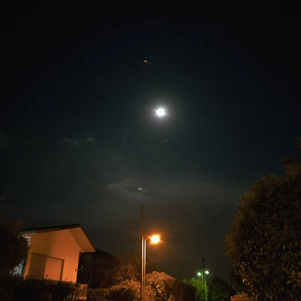
Moodcamera uses the iPhone’s dynamic range gain map to identify the brightest highlights and create realistic bloom and halation effects, according to the app’s official site. (Mood Camera)
That means they work best when there is actual light worth reacting to.
Lamps.
Neon.
Sun on metal.
Windows.
Car headlights.
Reflections.
White shirts in hard sun.
A bathroom mirror with bad intentions.
Bloom softens and spreads brightness.
Halation gives highlights that glowing, bleeding edge, especially useful around night lights or strong sources.
Use Bloom for softness.
Use Halation for light that misbehaves.
Use both when the scene deserves it.
Do not use both because you are bored.
Daytime pastel look? Bloom low or medium.
Night city? Bloom medium, Halation medium or high.
Clean portrait? Bloom low. Halation low or off.
Old print? Bloom medium, Halation low.
Tungsten gas-station madness? Halation can come out of its cage.
Aberration is even more dangerous.
A little aberration can add optical imperfection.
Too much and your photo looks like it was dropped as a child.
Use it sparingly.
The goal is character.
Not evidence of blunt trauma.
Step seven: Tone is where the preset becomes a print
Color is the mood.
Tone is the body.
This is where you decide whether the image is hard, soft, faded, dense, airy, dead, alive, or pretending to be alive for insurance reasons.
The main things to watch are Exposure, Contrast, Tone Curve, Fade, and Mute.
Exposure decides the general brightness.
Contrast decides separation.
Tone Curve decides where the image bends: shadows, mids, highlights.
Fade raises the black point. It makes black stop being black. It creates that old-print, lifted-shadow, nothing-is-ever-truly-dark feeling.
Mute reduces aggression. It calms the image. It can make color and contrast feel more restrained, less digital, less eager to be liked.
Do not confuse Fade with “vintage.”
Fade is a tool.
Too little fade and the image may feel digital.
Too much fade and everything looks like milk with regrets.
A useful test from the community is to check whether the darkest shadows are truly black and the brightest highlights are truly white. If they are not behaving, tweak Fade, Mute, and Tone Curve. If those areas have unwanted color contamination, go back to Emulation, Temp, and Tint. (Reddit)
This is the practical gospel.
Check the extremes.
The blacks tell you what the preset is hiding.
The whites tell you what the preset is pretending.
If your shadows are green and you did not ask for green, fix it.
If your highlights are yellow and you wanted ivory, fix it.
If everything is gray, flat, and sad, reduce Fade or increase contrast.
If everything is crunchy and digital, lower contrast, add bloom, change the curve, or stop photographing the refrigerator.
Step eight: Skin is the judge
You can make a preset that looks gorgeous on a wall.
That means nothing.
Walls are easy.
Walls do not have blood.
Skin is the test.
Skin reveals every bad decision. Too much green. Too much magenta. Too much orange. Too much contrast. Too much clarity. Too much emotional ambition from a person holding a phone in a kitchen.
If your preset makes skin look believable, you are probably close.
Not perfect.
Close.
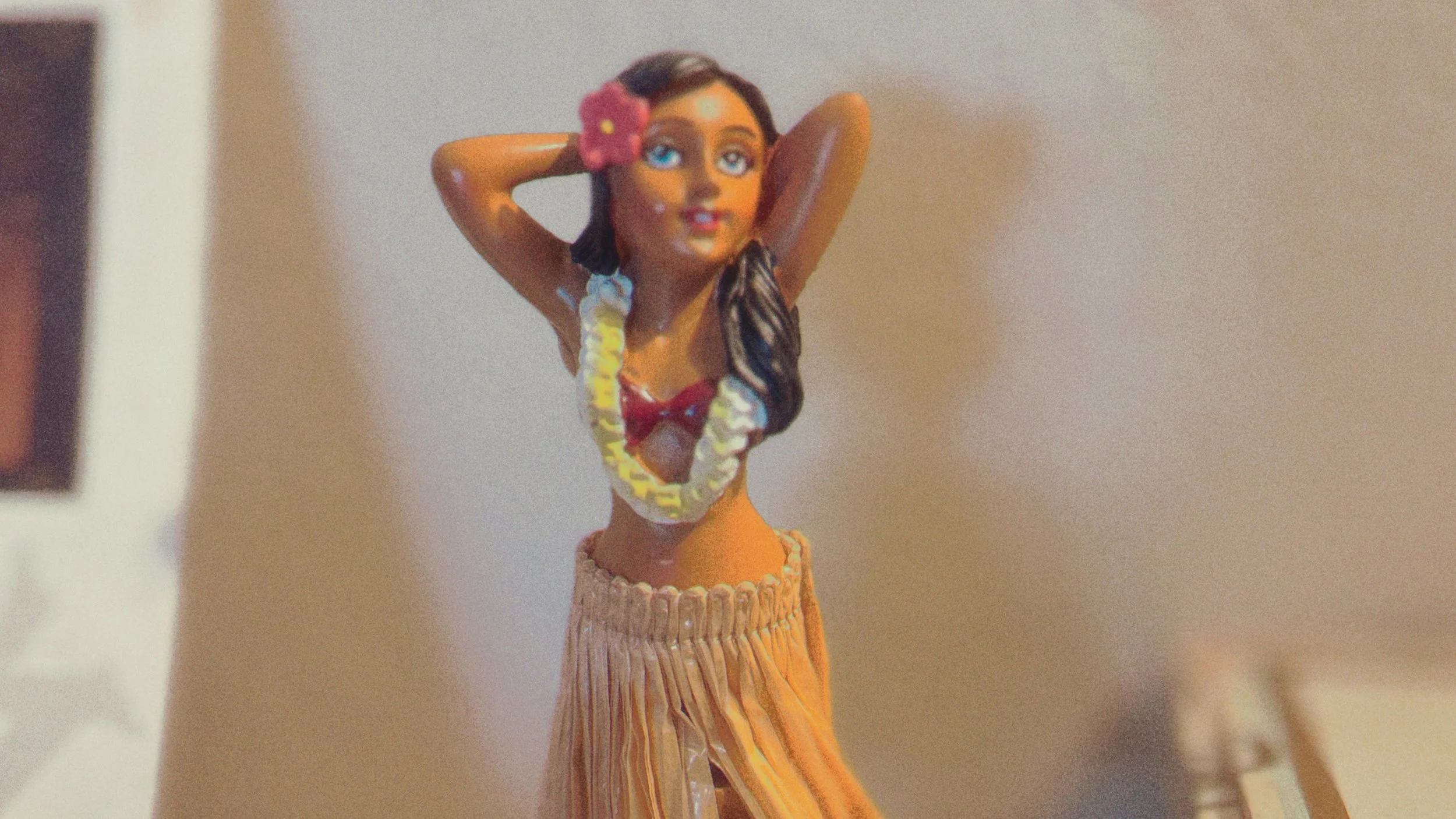
Portra is the safest starting point for skin. Gold can work if you control the warmth. Stock can work if you build the character yourself. Cine can work if the scene has mixed light. Analog can work if you are willing to explain yourself.
But always test on skin.
Even if the preset is not “for portraits.”
Because sooner or later there will be a person in the frame.
A hand.
A face.
A neck.
Someone’s ear looking oddly purple under a café lamp.
And your preset will stand trial.
Step nine: test the preset in three places before you trust it
Do not test a preset on one perfect photo.
That is how monsters are born.
Test it in daylight.
Then indoors.
Then in low light.
Daylight tells you if the colors are too loud.
Interiors tell you if the warmth is turning into soup.
Low light tells you if the shadows have joined a cult.
Also test these four things:
White walls.
Skin.
Green objects.
Deep shadows.
White walls reveal color casts.
Skin reveals cruelty.
Green objects reveal whether the preset is secretly Analog in a trench coat.
Deep shadows reveal whether Fade and Tint are lying to you.
If the preset survives all four, it may be allowed outside.
If it fails one, adjust.
If it fails all four, delete it and pretend you were conducting research.
A practical recipe for building a preset
Here is the method.
Not the romantic method.
The useful one.
Start with a reference mood, not a reference setting.
Do not say: I want Saturation +2 and Bloom Medium.
Say: I want a warm domestic memory with soft blacks and no green contamination.
Or: I want a cold urban night with red lights and dirty halation.
Or: I want a beach postcard that looks found in a drawer, not generated by a phone.
Then choose the emulation closest to that mood.
Set Strength high only to audition the character.
Lower Strength until the preset becomes usable.
Set Saturation before you touch Bloom.
Fix Temp and Tint before you touch Grain.
Choose Grain Level and Grain Size based on the material you want.
Add Bloom only if the highlights deserve softness.
Add Halation only if the lights deserve to bleed.
Set Contrast and Curve to build the body.
Use Fade carefully.
Use Mute when the preset starts acting too pleased with itself.
Test on daylight, indoor light, and low light.
Then rename it something you will remember.
Not “Preset 4.”
Never “Preset 4.”
Give it a name with a job.
“Kitchen Gold.”
“Dirty Metro.”
“Late Hotel.”
“Soft Funeral.”
“Riviera Fade.”
“Beauty Parlor 1964.”
A preset with a good name remembers what it is supposed to do.
A preset called “Preset 4” is already dead.
Common ways to ruin a Moodcamera preset
Use Strength High because you think stronger means better.
It does not.
Use Analog for everything vintage.
It is not “vintage.” It is green with a past.
Use Bloom on every photo.
Not every highlight deserves to be canonized.
Use Halation in daylight without a reason.
Now your window looks radioactive. Congratulations.
Add too much grain at the end.
Now your photo looks like it was seasoned with aquarium gravel.
Push Saturation before choosing the right emulation.
Now you have louder confusion.
Ignore skin.
Now everyone looks recently exhumed.
Ignore white walls.
Now your preset has a color cast and you find out only after taking twenty photos in someone’s apartment.
Create a preset from one reference image.
Now it works exactly once.
That is not a preset.
That is a souvenir.
The point is not perfection
The point is not to build the perfect Moodcamera preset.
Perfection is how we got into this mess.
The default iPhone camera already wants perfection. It wants balance, detail, recovery, sharpness, clarity, friendliness, usefulness. It wants every photo to be acceptable in a meeting.
A good Moodcamera preset should not be acceptable in a meeting.
It should have a bias.
It should have a flaw.
It should know what it loves and what it is willing to destroy.
Maybe it protects skin but kills blue skies.
Maybe it makes nights beautiful and daylight strange.
Maybe it turns kitchens into memories.
Maybe it makes the sea look like 1958.
Maybe it gives shadows a little green because sometimes the room deserves it.
That is the real reason to create custom presets.
Not to make every photo better.
To make every photo yours in the same wrong way.
Moodcamera does not give you infinite control.
Good.
Infinite control is how you spend forty minutes editing a picture of a chair and still feel nothing.
Moodcamera gives you enough control to make a decision.
Then it makes you shoot.
Then it makes you wait.
Then the image appears.
Maybe it worked.
Maybe it did not.
Maybe the preset needs less Tint, more Fade, lower Strength, smaller grain, less Bloom, a different base, a better name, a priest.
Fine.
Change it.
Shoot again.
Build the preset like you are building a personality: slowly, badly, with embarrassing early versions and at least one phase you hope nobody remembers.
Because the goal is not to remove mistakes.
The goal is to choose better mistakes.
The iPhone can keep its perfect sky.
You are here for the weather.